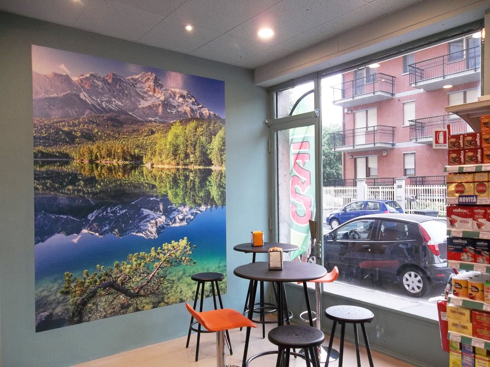
LITTLE SALES STRUCTURES
COLLEGNO
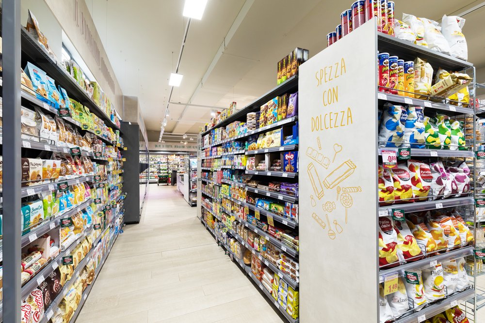
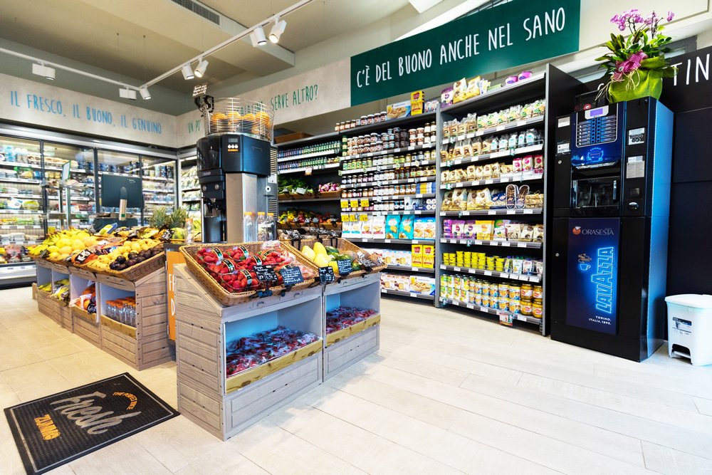
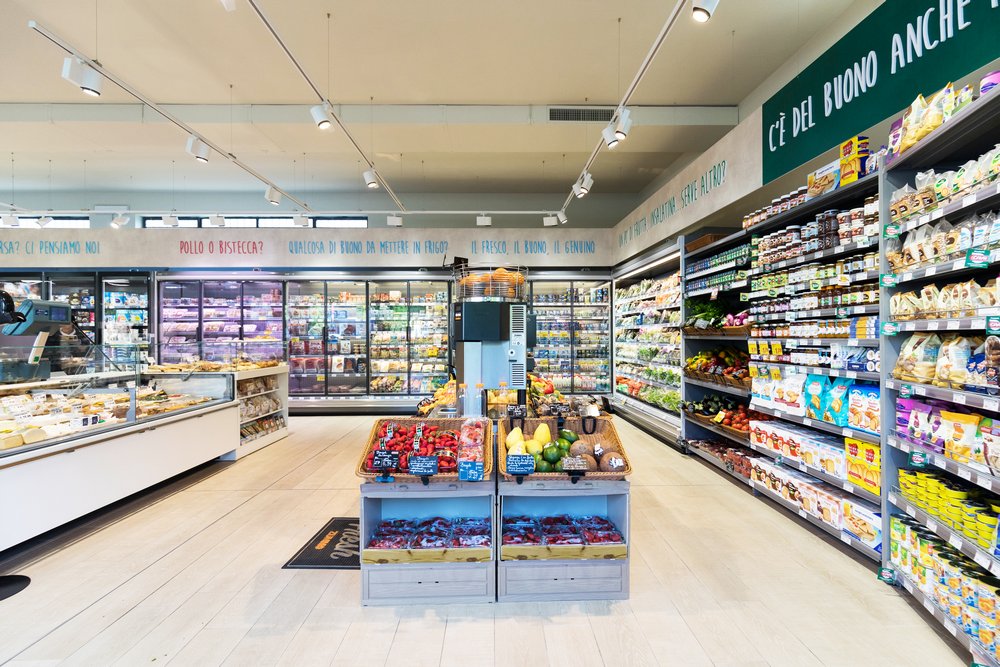
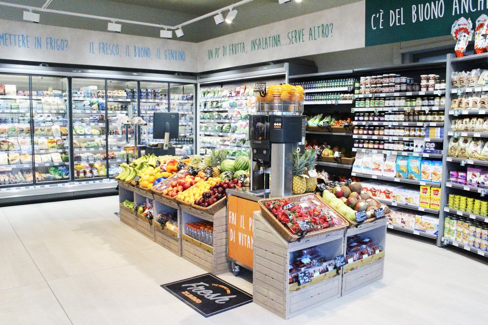
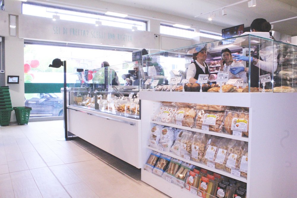
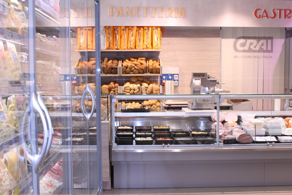
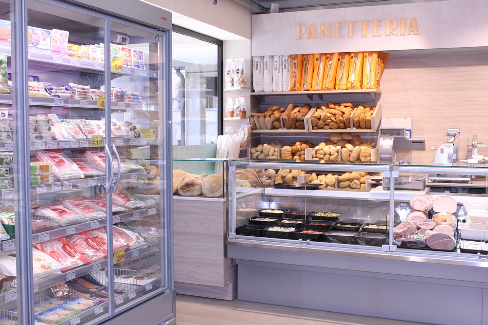
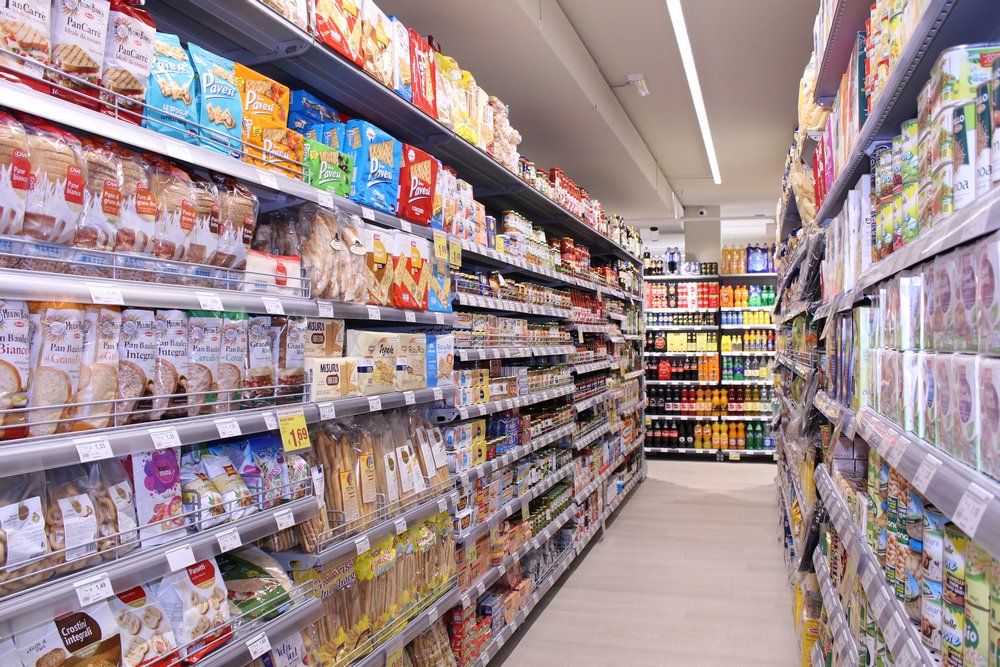
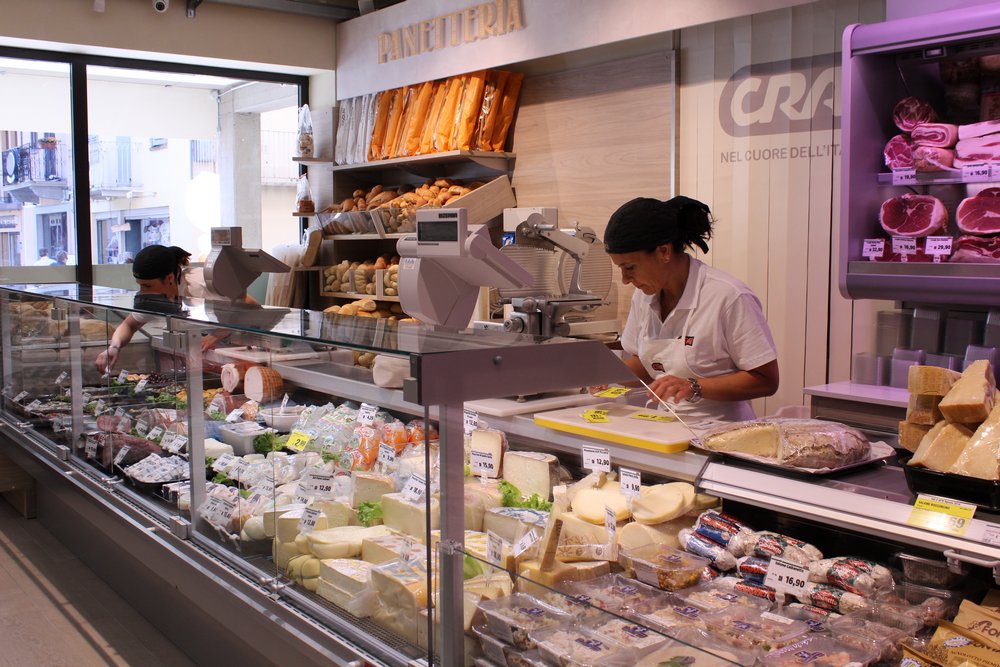
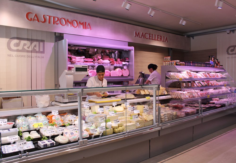
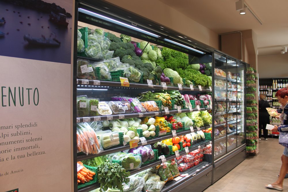
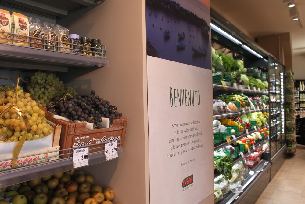
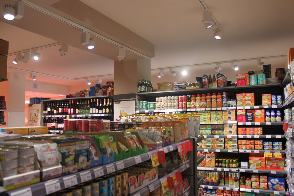
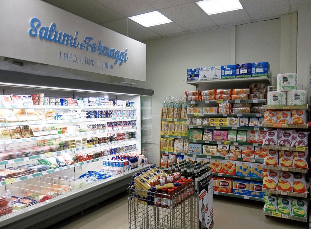
A NEW HEART FOR THE CRAI FORMAT
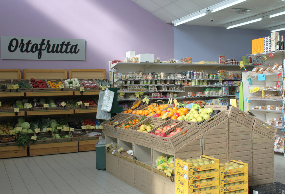
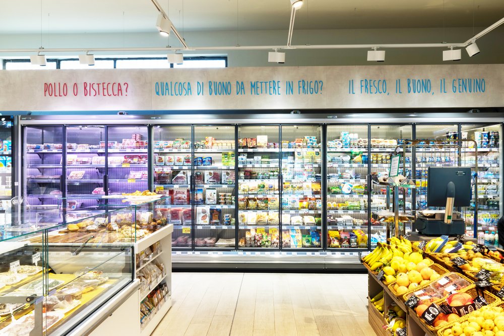
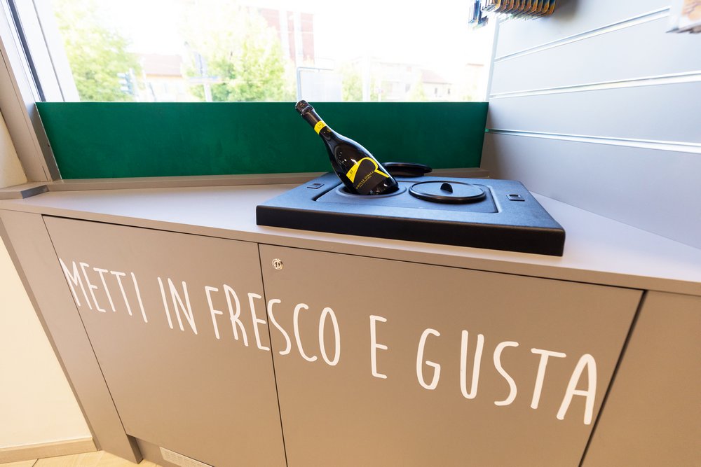
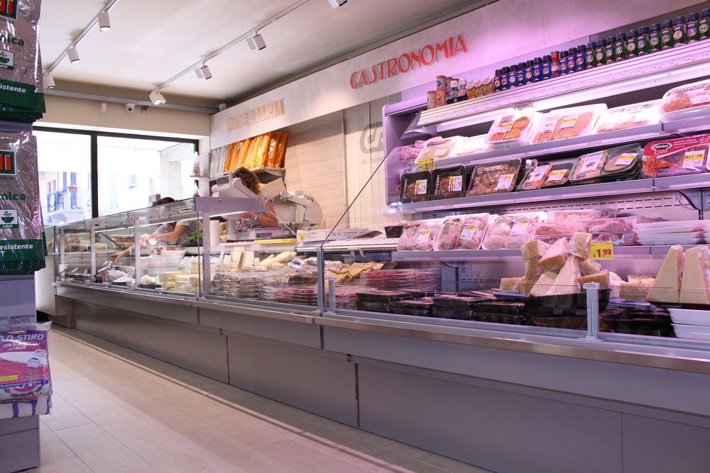
L’AB STUDIO can only say: << wowwww !!! >>. One fine day we are asked not only to design a new store, but that that store should have been a CUOR of CRAI and we should also have designed a new format to characterize it. Adhering to our slogan: “Respect for the past and the evolution of the future” we have studied a format that does not completely detach itself from the national CRAI format, but rather evolves it above all with a message: THE HEART of the CRAI HEART aims at FRESH products. And here the area of the counters becomes strategically organized to be managed by a few people, to have the entire sales area under control and to be in the nerve center of the shop. Among the novelties of the activity were also included: the machine for the freshest juices, the blast chiller of the bottles (for those who want to bring home the drink already cold), and an almost hourly rotation of the products on the counter. This rotation is linked to the various times of the day, therefore fresh croissants in the morning, and freshly baked lasagna in the evening. Communication also becomes lighter and “speaks” directly to the end customer. The central area of the gastronomy is clearly dressed in white, the color of freshness, purity, while the equipment takes on a double gray color, of which a dark gray inside the murals useful for giving an idea of depth.

A NEW HEART FOR THE CRAI FORMAT
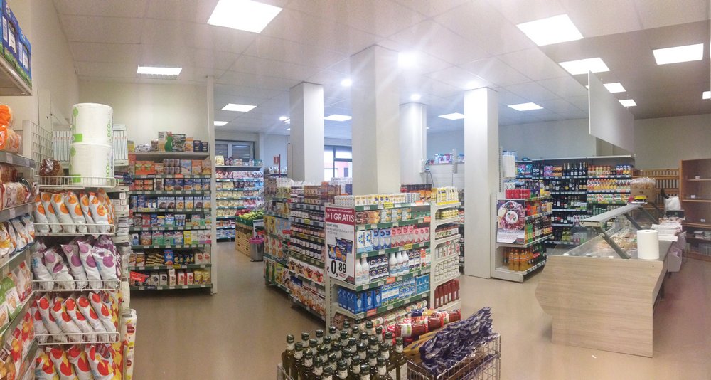
PIAZZA CRAVERI SUPERMARKET, PONT CANAVESE – A HIGH QUALITY SUPERMARKET
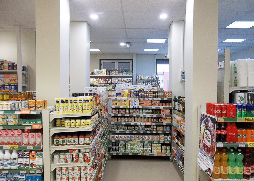
At the gates of the Gran Paradiso National Park, the project of this supermarket started in August 2017 in the Municipality of Pont Canavese. From the narrow streets of the town center, the client decided to give a decisive transformation, moving to a new local site in the central square. For this project we at L’AB STUDIO have been involved from the very beginning, throughout the process until the opening, that is: from the layout design, studied step by step with the client, to the building design, with a meticulous study and a design complying with the sanitary-sanitary requisites that are missing, and then follow as the work direction every single phase of the construction site. For the interior design, the criteria dictated by visual merchandising, ergonomic and comfort considerations and lastly the principles dictated by the CRAI FORMAT were followed. Details, care, attention and a group of high-level building workers have allowed us to obtain an amazing, competitive result.
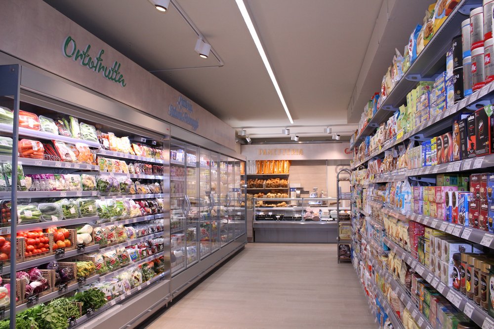


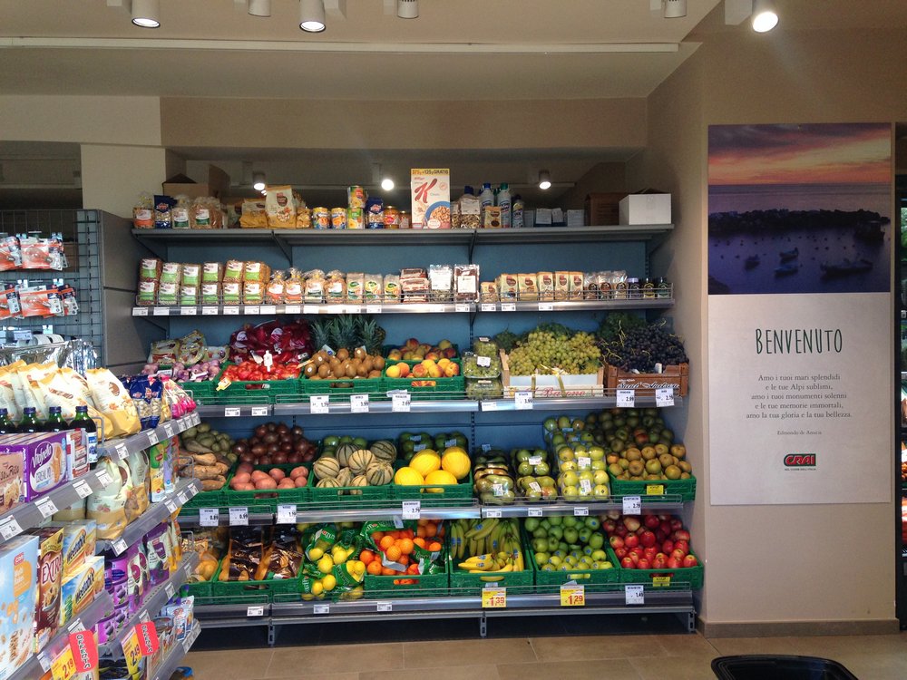
SUPERMARKET VIA AURELIA, ANDORA – THE COLORS OF SAND
A few steps from the sea, in the sultry summer of 2017, an opportunity has arrived in the studio that, seized on the fly, has led us to the planning and the possibility of following the realization of a point of sale as its position contains the scents and the lights of the sea.
In this case, the space was empty and “clean” to accommodate a new activity (as rarely happens), so adequate facilities were installed for comfort and functionality, and implemented all the answers to the requirements of the legislation. But we wanted more … with the client it was decided to create a harmonious environment with its surroundings so that customers arriving from the beach are welcomed in a similar environment, in a warm (or “cool” in summer) environment and pleasant. To give this “sand” effect we chose tiles that are not homogeneous in warm colors, like the beach, walls in three different colors in siliceous shades and shelves of the color of the rocks.


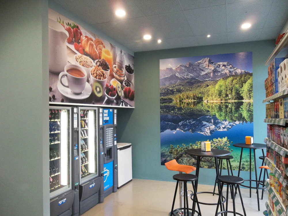
TRENTO STREET, GRUGLIASCO – A SUPERMARKET CHIC
In a few days the shop is rejuvenated, finally in step with the times and ready to welcome numerous new customers with new strength.
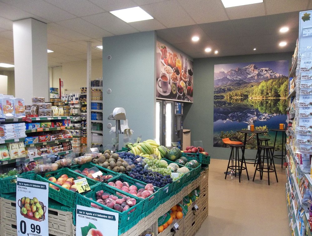
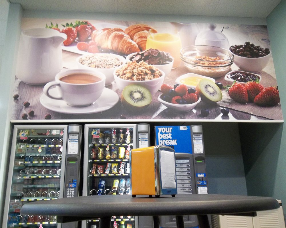
However, the years pass, the times evolve and the client felt the need to resume “running” together with the big ones, so we were asked to carry out a project that could revive the activity with an extra gear. This project has been configured as a combination of the sales activity and an area, commissioned by the client, of H24 vending machines. The two characteristics have been well identified, in addition to the functional level, also in terms of visual decoration and overall setting: the grocery store in the colors required by FORMAT CRAI, while the use of shades of sage for the area dedicated to distributors and consumption. For this intervention L’AB STUDIO was also in charge of carrying out the Works Management for the whole spectrum of the work and the themes present.
In a few days the shop is rejuvenated, finally in step with the times and ready to welcome numerous new customers with new strength.
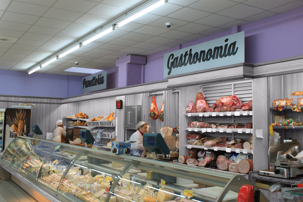
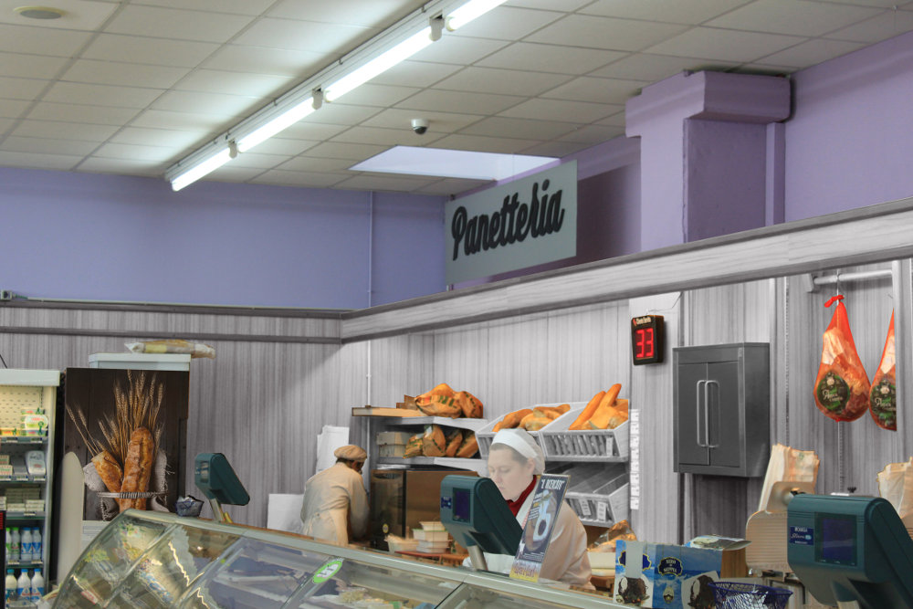
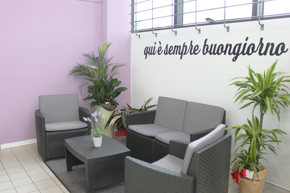
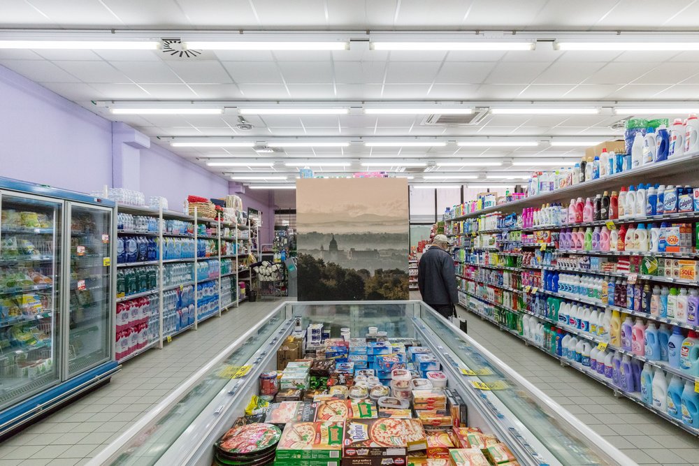
ARIGNANO – SUPERMARKET DRESSED IN L’AB STUDIO COLOURS
Well yes… who knows our logo sees that it is centered in colours from lilac to purple violet, colours that we would never have imagined to use in the design of a supermarket, until we came across this point of sale and its fantastic owners. Ability, firmness and sweetness concentrated in two solar people who run a Supermarket in Arignano, a place from which we can enjoy at dawn of wide panoramic views… and here is… the synthesis of lilac-purple violet colours L’AB STUDIO. The combination was found as a result of a rather complex search to find colours that were not overly pink, which were not too bluish and that, according to the observation point, they could turn out to be almost alive. To all this were added a small drawing room and a new butchery area, which infiltrate with grey benches among the other colours. Supermarket customers are excited and in the end… we plan for them.